
The Numou
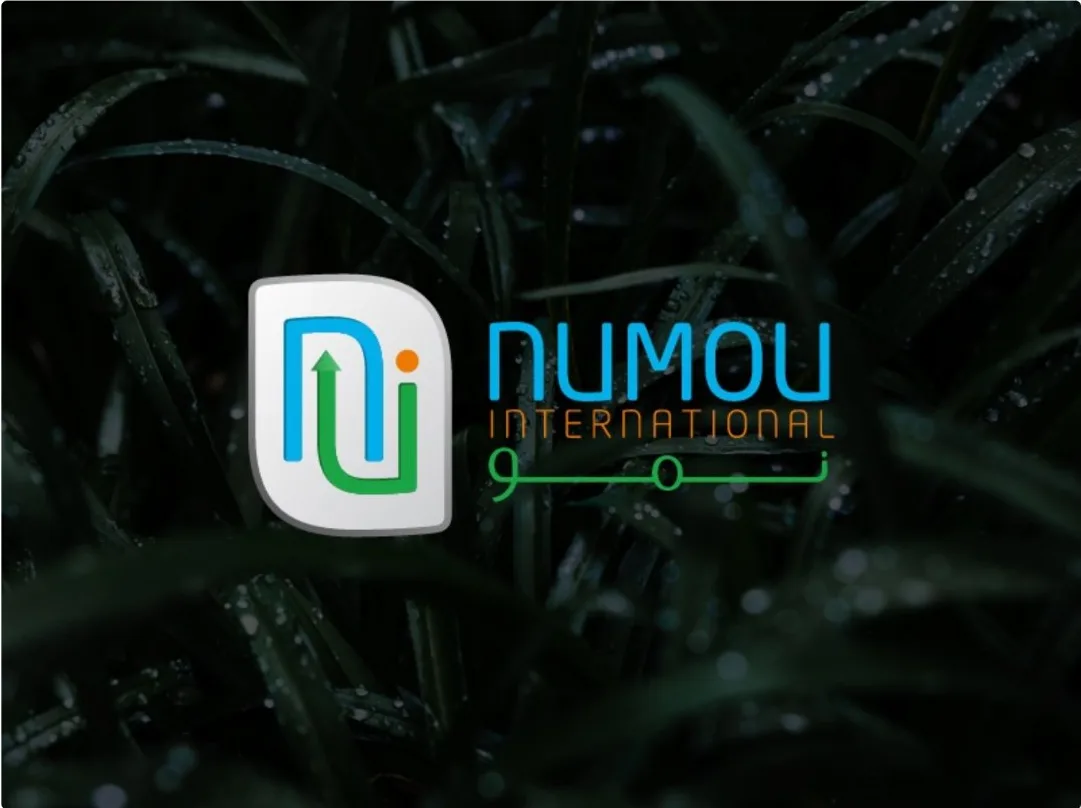
A minimalist identity for Numou International that carries the idea of evolution and organic growth, built on geometry and a nature-inspired palette.
- Client
- Numou International
- Services
- Logo, identity, guidelines
- Studio
- Branding & creative
- Published
- Apr 2026
The challenge
Numou needed an identity that felt grounded and aspirational at once, and worked equally well in Arabic and English, in print and on screen.
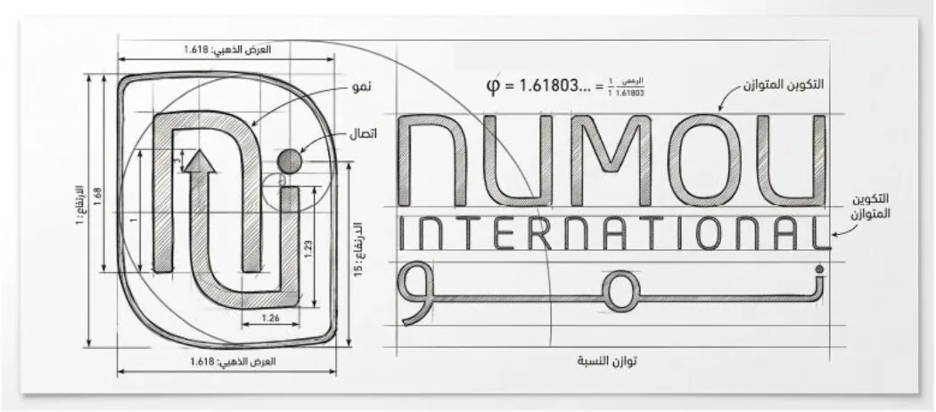
The mark is built from clean geometric lines that suggest upward movement. The palette pairs fresh greens with sky blue and a warm orange, so the brand feels natural, balanced and professional.
Logo rationale
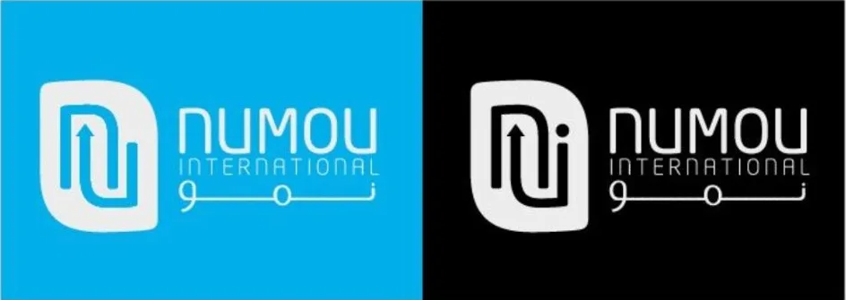
The Numou logo reflects growth, evolution and balance. Inspired by the meaning behind the name, it embraces simplicity and clarity so the message reads in an instant.
Clean, smooth type creates harmony and professionalism, and the minimal construction keeps the mark versatile across print and digital, memorable because it is simple.
(01)Gallery

(02)Palette
Colour system.